
Windows 11 preview is here
1. Lock screen interface
The change of the lock screen was not mentioned in the press conference. The new version of the lock screen is similar to a mobile phone, with the time and date displayed in the center, and is no longer in the lower left corner of the screen like Windows 10. Instead of using Microsoft Yahei, the font is replaced with a brand new arc text. The schedule alarm is still displayed on the lock screen, but it cannot be opened directly by tapping it like a mobile phone.

New version of the lock screen interface
In terms of settings, the previous Windows 10 can customize the display content and support multiple sets of information. The new version of the lock screen can only choose one of three options among calendar, mail, and weather, and no other applications can be added. In the new version, you can still see some sections that have not yet completed the UI transformation, but they are not as obvious as Windows 10.

No longer supports custom display of information

There are still sections with unfinished UI transformation
2. Start menu
The start menu is consistent with the leaked version, and there is no top search bar. The entire menu is divided into three parts: upper/middle/lower, corresponding to applications, recommended lists, and commonly used commands. Like the press conference, the recommended list here is also composed of the most frequently used applications, recently added applications, and files that have just been used. A more detailed list can be viewed through the “More >” button. In addition, after the user clicks Settings→Personalization→Start, he can decide the display content of the area by himself, which is the same as Windows 10.

Start Menu
Frequently used commands can be added from the settings panel, and support right-click to quickly add and delete. Like the leaked version, a temporary menu pops up after right-clicking the start icon, and users can use it to call modules such as Task Manager, Run, and Windows Terminal. The taskbar supports left-positioning, and users who are not used to centering can return to the style of Windows 10, reducing learning costs.

Right-click to quickly add and delete shortcut commands

Right-click temporary menu
3. Gadgets
Widgets have added search bar and Widgets manual addition and deletion functions. The weather, stocks, traffic, and schedule mentioned in the press conference can almost be found now. Widgets support three sizes of small/medium/large and can be dragged to adjust the position. Some functions can be directly operated in the interface, such as creating schedules, querying stocks, etc.

small tools
Compared with the tiles backed by UWP, the data of gadgets all come from online. Therefore, even if it is Photos, it opens OneDrive (online version) after clicking it. And currently there are only a few official preset gadgets to choose from, and the number is not very rich.

The number of gadgets is still relatively small
In addition to efficiency tools, news tools have also added interactive features. Click “Like” to like the information, and click emoticons to communicate with netizens. On the right side of the panel is the command menu, which provides functions such as reducing recommendations and one-click sharing. In addition, it also presets a “read later”, you can collect important information and read it together.
4. Settings Panel
The setting panel adopts a left-right layout. The biggest advantage is that no matter where you are, you can quickly jump to the required module. However, compared with the screenshots of the press conference, the current version has less “frosted glass” special effects, and the sense of quality is much worse.

New version settings panel
The second-level module uses the layout logic in Windows 10, but the terminal page is replaced with a more concise button style. It is worth mentioning that in addition to the left menu, the top tab bar also has a jump function. This is actually the same as the address bar, which is very efficient in actual use.

Detail changes
The new version does not add new features, but has done a reclassification of existing features. Compared with the previous version, the module division of the new version is more organized, and it is also more convenient for Windows 10 users to get started. The classic panel entry appears less in Windows 11, such as the previous power management panel, which is no longer found in the new version.

The project display has been optimized to look more organized
5. File Explorer
File Explorer enables a new design, cancels the top Ribbon panel, and commonly used commands are fixed on the toolbar in the form of icons. When different objects are selected, the corresponding icons will light up to remind the user which operations are valid.

New version of file explorer
Thanks to the new arrangement, the new version of File Explorer replaces all previous functions with only a few icons. Infrequently used functions are hidden in “…” and can be seen by clicking the button. On the one hand, the new design ensures the simplicity of the panel, on the other hand, it does not lose the superiority of Windows Explorer, which is a relatively perfect result.

New version of button toolbar
The new resource manager supports two styles of loose/compact, corresponding to tablet users and keyboard and mouse users respectively. The right-click menu enables the new UI. In addition to the larger position spacing, one of the most obvious changes is to replace the four functions of cut, copy, rename, and delete with icons (familiar! Think about Office).
In the menu content, several groups of commands, Compress to ZIP file, Copy as path, and Open in Windows terminal are newly added, and the third-party software menu is automatically blocked. If users have access requirements, they can click “Show more options” to visit separately.

New version of right-click menu
The desktop menu has also been replaced with a new UI, but there is a small problem-the “refresh” is gone. At present, Microsoft has no explanation for this. Fortunately, the F5 key is still effective. After all, this function is usually used a lot.

The desktop right-click menu is missing “refresh”
Compared with the traditional resource manager, the new resource manager performs slightly better in a dark environment, but the color of the icon is still very dazzling. The newly added toolbar is also generally dark, which is not very recognizable in actual use. In addition, there is still the problem, the entire interface lacks “frosted glass”, and the overall sense of high-level is insufficient.

Night mode performs well
6. Operation Center & Notification Center
The notification center uses a separate UI and is no longer tied to the operation center. The calendar panel provides a folding function to reserve more space for the notification area. In addition to the appearance changes, the new version also adds operable buttons for some panels. For example, an application that has just been updated can be opened directly or pinned to the start menu.

Split notification center
The operation center appears independently, and the previous network buttons and volume buttons belong to the same hot zone. No matter which area is clicked, a complete operation center can be called up. The volume slider and brightness slider are fixed under the panel, which is more convenient than Windows 10. If the audio-visual software is turned on (UWP only), a Mini panel will pop up at the top to facilitate operations such as play/pause, forward, and rewind.

New Operations Center
7. Virtual keyboard skinning
The virtual keyboard has a skin-changing function. In addition to the default light/dark color, there are also many new themes built-in. The size adjustment is a bright spot, and it was not discussed in the previous press conference. But at present, it can only be controlled by a slider, so the convenience is average. The one-handed keyboard is a good idea, which can meet the needs of some special scenes, but it lacks the nine-square pattern and is always not friendly to the Chinese.

Virtual keyboard support themes

Keyboard size adjustment & one-handed keyboard
8. Virtual Desktop
Compared with Windows 10, the virtual desktop has less timeline (TimeLine), an independent wallpaper and a bottom switching bar are added. However, the appearance design is far from the press conference, and it is almost the difference between a mass production version and a concept version. The new version does not have the cross-window drag and drop like MacOS, and the right-click menu is still required to move windows, which is still not as convenient as Mac.

Virtual desktop
In terms of multiple monitors, I focused on testing its window memory and layout capabilities. Consistent with the press conference, Windows 11 can automatically remember the window layout of each monitor. And after the display is reconnected, it will automatically return to the previous style.

After the external monitor is reconnected, the previous window layout can be automatically restored
9. App Store
Compared with Windows 10, the application store has changed a lot, and the appearance is very close to the release conference version. The biggest impression left to me by the new version is the ultra-fast screenshot display speed. If you don’t see the lag, you can open it to view the screenshot. In addition, the download speed has also been greatly improved, and many software can easily run to full speed. In terms of experience, the new version is at least one step up from the old version.

Store speed has increased significantly
In terms of content, the store currently only provides apps, games, and movies (the regional settings have been modified to the United States). The legendary Android sub-forum did not appear, and I even tried another magic operation-double-clicking the APK, but it also had no result.
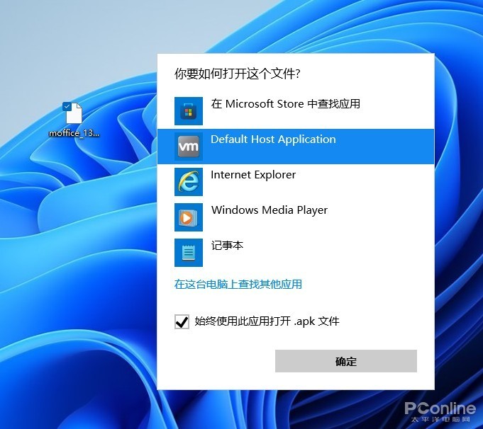
Not only does it not exist in the app store, but the legendary “double-click APK” does not respond.
Application updates and downloads have been moved to the lower left corner. The basic functions are the same as Windows 10, except that the progress bar has changed slightly. Below is the software that you have purchased or downloaded before. Although it is the same as Windows 10, it looks easier to understand.

App update and download
10. Other changes
Other places have not changed much, such as the multitasking layout, which is the same as the previous leaked version. Microsoft Teams has not yet been added to this version, and it is temporarily unavailable. Some functional modules still retain the traditional appearance, such as device manager, backup, task manager, control panel, etc. The dictation module (Win+H) uses a new toolbar for the first time, which looks more concise. As for other built-in applications, most of them still keep the same as in Windows 10, and there are no adjustments.

Traditional control panel

Task manager

New Dictation Toolbar

calendar

Calculator

Floating notification panel

File transfer panel
Here is a special talk about the Chinese issue. Like the leaked version, this upgrade is still in the English version. But the official Chinese package is already very powerful, basically covering most areas such as the start menu, settings, file explorer, operation center, notification center, gadgets and so on. It is perfectly fine to use it as a half Chinese version.

High degree of Sinicization
Write at the end
Generally speaking, the changes this time are quite thorough, and the entire Windows 11 design style tends to be more youthful. No matter the interface or the operation logic, there is an obvious sense of modernity. As the first preview version, the optimization of this version is also in place, basically no obvious freezes and crashes, most of the software can be installed and run normally.

Windows 11 is here, are you looking forward to it?
However, as mentioned above, the new version still has room for improvement in UI. In particular, individual modules (such as File Explorer) do not perform well in dark mode. On the other hand, the actual effects of “Settings” and “Resource Manager” also have a certain gap with the press conference. Generally speaking, the “high-level sense” is lacking. However, the flaws do not conceal the advantages. From the overall performance, the new version is still very satisfactory. So such Windows 11, are you looking forward to it?
.