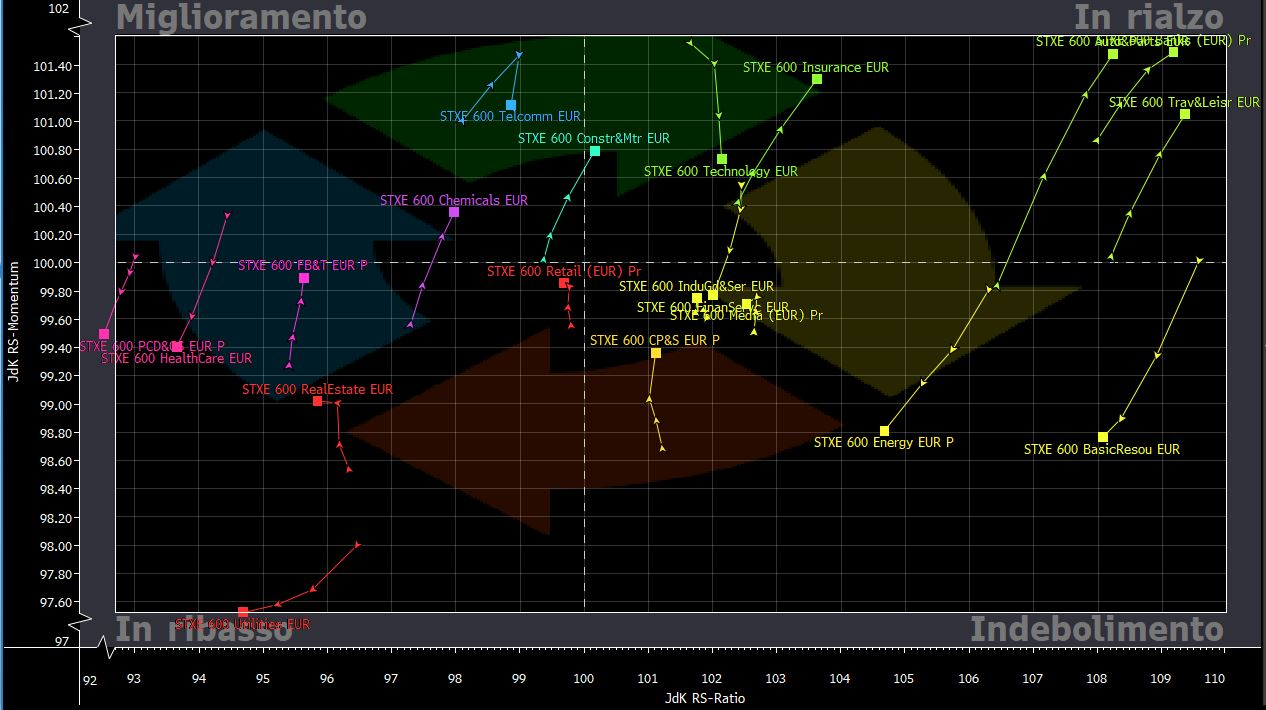
The best: banks, insurance, travel and leisure and automotive in dust, the building and materials sector knocks on the door
Let’s see together compared to last week which European sectors are confirming the strength and which ones have slowed down or reversed the trend. According to a weekly time frame reading of the Relative Rotation Graph the European sector indices that are outperforming the STOXX Europe 600 (benchmark) with a strengthening in both relative strength and momentum are: STOXX Europe 600 Banks, it STOXX Europe 600 Insurance, it STOXX Europe 600 Travel & Leisure and the automotive sector, which confirm the trend of last week. It is also one of the leading sectors for the first week STOXX Europe 600 Construction&Materials. These are the sectors best set up on 09 April 2021.
We also report that the benchmark is outperforming the index but with a net trend of weakening momentum Technology. Instead, the “weakening” sector enters the sector Financial Services, with Energy and it Basic Resources which have slowed significantly in terms of momentum.
Highlights: Chemistry in recovery
They are confirmed in the quadrant of improving sectors (top left) STOXX Europe 600 Telecommunications, which however this week saw a decline in momentum (therefore to be monitored in the coming weeks). The sector of the Chemistry.
The Worst: Defensive Sufferers with Real Estate
In the quadrant of the sectors “In decline” the defensive sectors are confirmed with Utilities, HealthCare and also the Real Estate.
Quick guide to reading the Relative Rotation Graph
The Relative Rotation Graph (RRG), is a tool based on methods and algorithms developed by Julius de Kempenaer. This tool is very useful for analyzing trends in relative strength of different equity sectors against a benchmark and the momentum. In particular, the real power of this tool lies in its ability to plot relative performance on a graph and show the sectoral rotations. The RRG uses four quadrants to define the four phases of a relative trend: “weakening”, “falling”, “improving” and “rising”. Sectoral rotations therefore consist in the gradual passage of sectoral indices from one quadrant to another.
To correctly read the RRG it is necessary to understand the meaning of the two main inputs underlying the instrument: JdK RS-Ratio and JdK RS-Momentum. The JdK RS-Ratio, present on the horizontal axis, is in fact an indicator of relative strength and tells us if the sector index in question, for example the STOXX Europe 600 Banks, is outperforming or underperforming the benchmark, in this case the STOXX Europe 600. A JdK RS-Ratio equal to 100 in fact implies a movement of the sector that can be overwritten with that of the benchmark, therefore with little added value. A JdK RS-Ratio greater than 100 implies greater relative strength, while less than 100 implies lower relative strength. The JdK RS-Momentum instead, it is a momentum indicator and tells us how quickly this sector outperformance or underperformance movement occurs on the benchmark. Also in this case JdK RS-Momentum equal to 100 tells us that the sector has developed a trend strength equal to that of the benchmark. A JdK RS-Momentum less than 100 indicates a less directional (fast) movement, while if it is greater than 100 it is the opposite.
As we said therefore, the Relative Rotation Graph generates four quadrants. The strongest stocks can be found in the upper right corner (quadrant “On the rise”) And are the leading sectors in that market situation. They are outperforming “Weakening“, But those in the lower right quadrant have slowed compared to the benchmark and therefore are at risk of underperforming, or entering the” quadrant “Down“. In fact, if the pace of performance decreases further, the sector will begin to underperform ending up in the lower left quadrant. From here, if the sectors begin to recover momentum moving more strongly than the benchmark, they will pass into the quadrant “Improvement”And are candidates to return to that of the“ Rising ”, as soon as they return to outperform the benchmark.
To find information on the different European sectors, visit the link.
To find information on the different American sectors, visit the link.
For more detailed information on the tool visit the link.