
I think this is the closest to perfection.
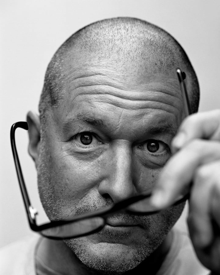
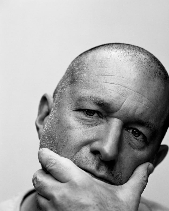
Jony Ive, Apple’s former chief design officer, was talking about the eponymous typeface of LoveFrom, the design firm he founded after leaving Apple.
How much does he like the design?
He liked it so much that he printed the italic text of LoveFrom font and put it on his desk for a long time.
a name to start a conversation
To talk about the font design of LoveFrom, you cannot avoid the meaning behind the name.
“LoveFrom” is a name with its own “voice” in my mind.
Ive once shared that the name was inspired by a passage Jobs said:
In a staff meeting many years ago, Steve was saying… he said one of the most fundamental drives is when you create something with love and care, even though you’ll probably never see the things you The people who designed it will never be able to shake their hands, but by doing something with care, you are already showing gratitude to humanity and the human species.
Ive deeply resonated with this passage, and decided to name the new company “LoveFrom” – if design is Ive’s “letter” to express love to the world, then “LoveFrom” is the imprint left by the signature – “It Succinctly communicates the reasons behind what I do.”
However, it was not easy to come up with a visual expression for the name.
The famous graphic designer Peter Saville felt very honored when he received this task, but he also had a headache:
Because people are so familiar with the word (“love”). It is actually very difficult to present the word in a new way.
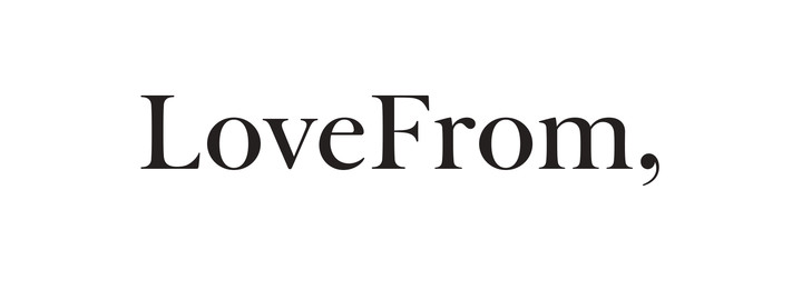
Finally, Saville came up with something particularly clever: adding a comma after the name.
This comma invisibly balances the high-frequency word “love”, because this symbol rarely appears in logo design.
At the same time, it also makes the name more authentic, expressing the openness of LoveFrom, a company that is always open to conversation.
Look, this is the “voice” of LoveFrom
When Ive announced the establishment of a new company, everyone will look at it with the heart of looking for “Apple Traces”.
In the bright place, we cannot see the expected “apple traces” in the LoveFrom font, and where there is indeed a continuation, it is difficult for us to see with the naked eye.
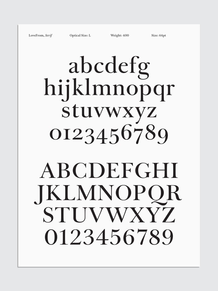
When choosing a reference glyph, Ive moved away from the expected simplicity of sans serifs in favor of serifs.
After some research, Antonio Cavedoni, a LoveFrom designer who also worked at Apple before, chose Baskerville as the basis for his design.
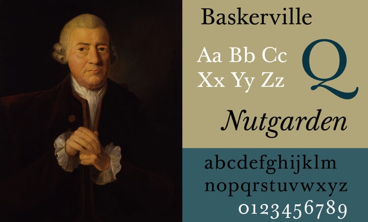
▲ John Baskerville and his font Baskerville
This classic typeface is familiar to everyone, but expressive enough that it can be integrated into different contexts.
Just as important, John Baskerville, who designed the typeface, has an obsession with typography that fits well with the members of LoveFrom.
Baskerville’s obsession with fonts is not limited to font design, but extends to every metal “stamping” used in font printing, and finally even improved the formula of printing inks, all just to make the final book printing better.
Cavedoni, who is also a detail fanatic, not only studied a large number of printed texts of Baskerville, but also found that researcher Robin Hull had made very careful photographic records of Baskerville’s initial stamping, so he returned his learning to the “origin” and directly studied stamping.
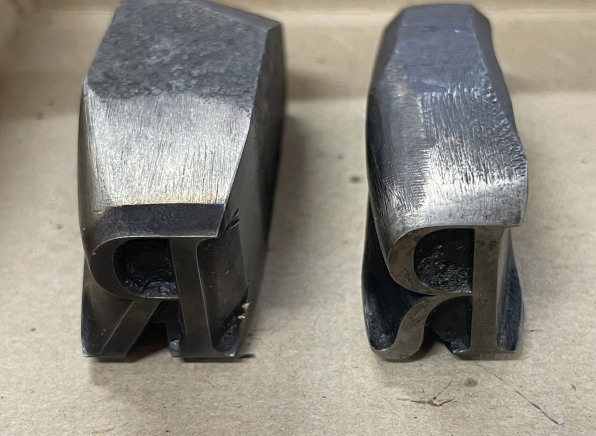
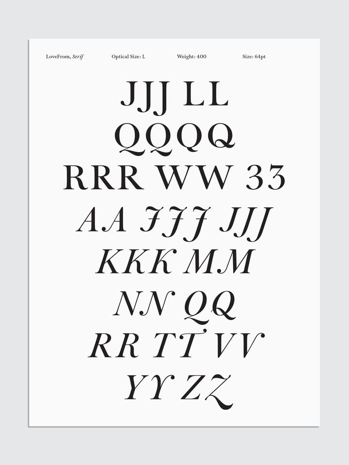
Thinning the stems and tightening the serifs, Cavedoni began tweaking letter-by-letter the reproduction of the original Baskerville typeface, cutting out the look of “LoveFrom.”
Naturally, the team then began to design a complete set of fonts based on this, and continued to experiment with different weights to create italic, bold and other variations.
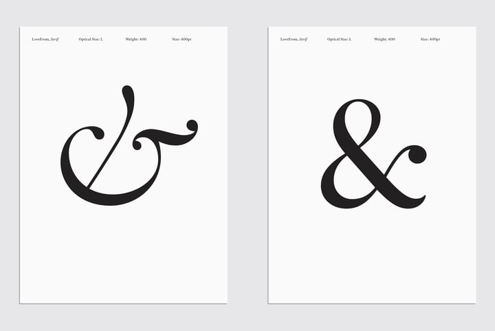
What I said before that Ive loves to put it on the case is the italics.
Cavedoni added some “speed” to LoveFrom’s italics.
“Fast Company” global design editor-in-chief Mark Wilson said that the italic lowercase “b”, “d” and “h” serifs are like a convertible with the top open, and the wind blows the hair back, full of movement.
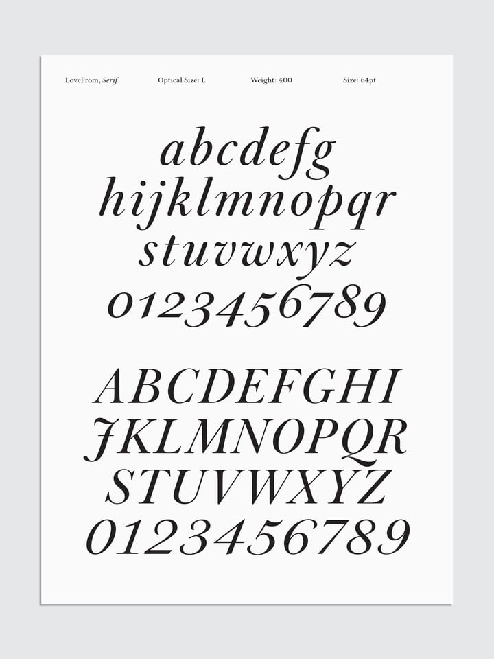
The details in the uppercase letters are also overflowing. Is the tail of “K” so full that it is about to drip.
These more ornate letters may not remind you of Apple’s design, but one of them is what Ive has been insisting on since Apple – “continuous curvature”.
Of the company’s obsession with aesthetics, Marc Newson said:
Maybe this will sound controversial, but it’s a matter of taste.
For us, that’s the difference between something middle-of-the-road and something satisfying, more than good.
It is challenging to achieve curvature continuity on high-end industrial design products, but it is simply impossible to achieve curvature continuity on letters that are only composed of limited pixels, and to make various application versions meet this standard.
Until the former Apple engineer Patch Kessler appeared.
The mathematician devised a tool that can analyze vector profiles and transform them into curvature continuities at any scale.
▲ Before (red) and after modification (green) by the Kessler tool
I think this is emblematic of Jony’s vision of positioning LoveFrom as an interdisciplinary studio, where expertise in one area influences expertise in another.
Chris Wilson, Apple’s former head of UI, said he is now also a member of the LoveFrom team.
Now, this set of fonts is like the sound of LoveFrom.
On the one hand, it uses visible and invisible details and considerations to convey the concept of LoveFrom; on the other hand, it is also a “tool” for LoveFrom to communicate.
“I am a practical craftsman”
I love creating fundamentally useful things. I am a very practical craftsman.
Ive described himself this way in an interview in 2022.
However, after reading LoveFrom’s nearly nit-picking requirements for fonts, you may feel that this is a bit far from “practical”.
But it is undeniable that this set of fonts has indeed become an important “tool” for LoveFrom, and its openness allows it to be integrated into various projects of the company. Wilson added:
The sound (of LoveFrom) feels like it could be timeless, but also adaptable to a very wide range of projects…whether purely industrial design, branding, fashion or environmental projects.
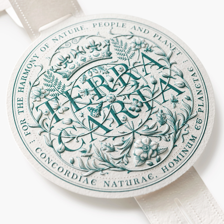
▲ Application of LoveFrom in the environmental protection project Terra Carta
When designing the logo for the coronation ceremony of King Charles III of the United Kingdom, LoveFrom fonts were incorporated into the natural and crown elements representing Charles, reflecting the optimism and solemnity of the royal family.
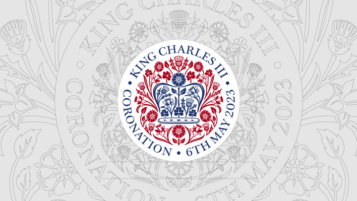
▲ The application of LoveFrom on the logo of the coronation ceremony of Charles III
The recently launched new book about Jobs, Make Something Wonderful, also uses two variants of the LoveFrom font, including a bold variant that LoveFrom specially designed for the “Jobs Archives” webpage.
Through imperceptible fine-tuning, LoveFrom typeface organically meets the needs of different clients.
Compared with “customers”, Ive prefers to call them “friends”.
A design company “obsessed” with language and dialogue
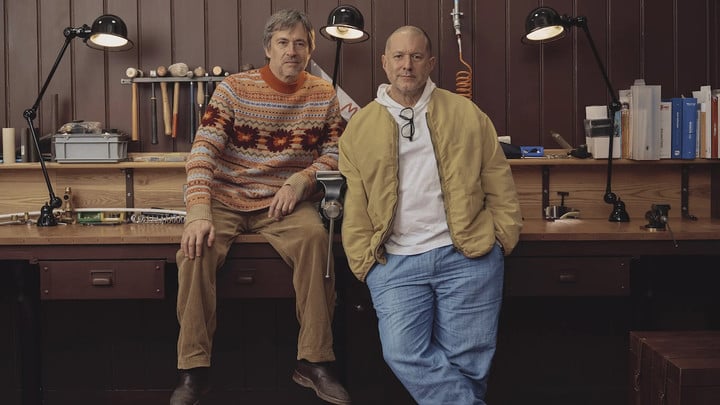
▲ Ive and partner Marc Newson in LoveFrom’s office
LoveFrom is quite possibly the only creative design firm with a full-time copyist.
Part of the scribe’s job is to help the team of graphic designers, architects, sound engineers and industrial designers put their ideas into words.
When LoveFrom launched, one of the first job openings was for a full-time author.
Why is LoveFrom so obsessed with words?
In Ive’s view, language is the first step in design.
When Ive starts a design task, the first thing I do is not to draw a sketch, but to have a conversation:
Words are very powerful.
If I say I’m going to design a chair, think about how dangerous it is. Because you just said “chair,” it means you’ve rejected a thousand ideas.
One of LoveFrom’s earliest customers, Brian Chesky, co-founder of Airbnb, experienced the power of conversation.
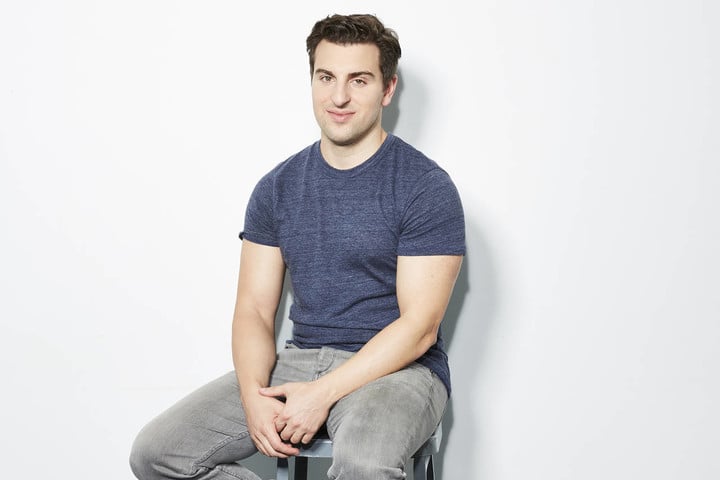
▲ Airbnb co-founder Brian Chesky. LoveFrom advises Airbnb on everything from design to strategy
At the beginning of the epidemic, Airbnb’s orders fell by 80%. From that time on, Chesky and Ive chatted almost every day.
Many times, I’ve done white papers for clients, filled with reference text.
On Airbnb’s white paper, LoveFrom wrote “beyond where and when.”
LoveFrom suggested that Airbnb should not be restricted by the conspicuous “where” and “when” on the product homepage, and Ive continued to tell Chesky during the chat that the soul of Airbnb should be “connection (connection)”.
Chesky, who came out of the design school, said frankly that he thought he knew design, but he only understood the deep meaning of design after working with Ive:
People think design is about how things look. But that’s a superficial definition — it should be about the way things work.
Knowing the importance of dialogue in Ive’s design, it is not difficult for us to understand why LoveFrom gathered a group of the best designers of our time and spent four years designing and adjusting the LoveFrom font.
This is completely unreasonable in terms of economic investment.
The only reasonable explanation you can find for us doing this is simply because we think it’s important and we care.
Do we care only for ourselves? No, in fact we believe it is in the service of culture.
In Mark Wilson’s view, the font design of LoveFrom represents the firm’s pursuit:
LoveFrom is slowly pursuing a “Grand Unified Theory” in the design world, pursuing unrecognized connections in cross-disciplinary design, to achieve a perfect new form.
Apparently, I’ve been in no rush:
The beauty (of the LoveFrom typography) is that we did it spontaneously, and I don’t think we’ll ever put an end to it.