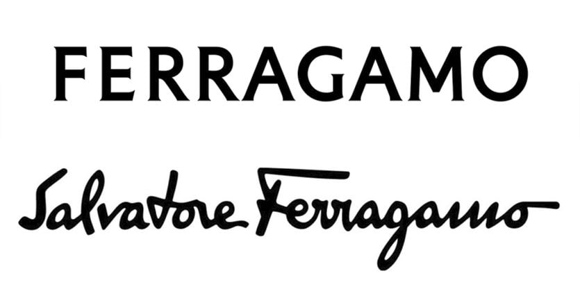
The evolution process of the brand is underway and also includes the change of the logo: Salvatore Ferragamo has also decided to focus on a font sans serif, therefore very essential and with few “graces”, as the name indicates, and so the founder’s handwriting gave way to a “Ferragamo” described by the company as “of strong impact, elegant, assertive, in tension between classicism and modernity” .
It was designed by graphic designer Peter Saville, already author of the new Burberry logo launched in 2018 when the British house set a new course also with the appointment of Riccardo Tisci as creative director. And even in that case the references to the past, specifically the knight in use since 1901, disappeared to make room for sans serif letters.
Why do they all look the same?
As can be appreciated from the numerous comments on social networks, graphics enthusiasts are currently discussing yet another logo that shares the same style. The abandonment of original elements, capable of recalling a signature, a story, a symbol, is often chosen to communicate in a more global world, regardless of sometimes insidious cultural and aesthetic differences, according to a universal graphic language. Furthermore, the extreme clarity and readability of the font allows perfect readability in the confused, sometimes chaotic and increasingly overcrowded digital environment.
The new Ferragamo logo “refers to the stone engravings that inspired Renaissance artists”, reads the note from the Florentine brand, and the CEO Marco Gobbetti, who joined the company at the beginning of the year to mark the new course, confirms that «The new logo contains and at the same time expands history and present. It is not just a logo: it is the starting point of a new chapter for Ferragamo ».
The most sensational cases, from Saint Laurent to Balenciaga
A new chapter that also begins with a change at the creative top, where Maximilian Davis arrived last March. The contemporary change of logo and creative direction has often occurred in the last ten years: in 2012, in fact, the arrival of Hedi Slimane at the helm of Yves Saint Laurent marked a sensational evolution, since the flaming logo designed in 1961 by Adolphe Cassandre, who drew on the couturier’s signature, left room for a dry sans serif where “Yves” disappeared. Not a few rebelled against the attack, but not only the project was awarded by Wallpaper as “Best Rebranding” of the year. In fact, it opened the way for many others: of Burberry we mentioned earlier, but then Balenciaga made the same choice (when the disruptive Demna arrived in 2015), Balmain, Calvin Klein, Celine (where Hedi Slimane, again he, also eliminated the accent on the first E), Berluti.
